
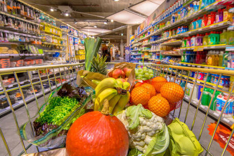
1. Fresh Produce at the Entrance: A Healthy First Impression
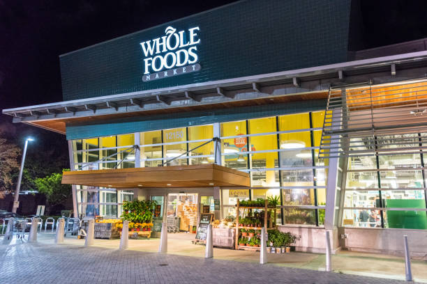
You walk into a grocery store and the first thing that greets you is color; fresh fruits, bright vegetables, neatly arranged displays that feel almost inviting. It feels like a good start, like you’re making a healthy choice just by being there. But there’s a reason this section is almost always placed right at the entrance. Retail experts often point out that “placing fresh produce first creates a positive emotional tone that influences the rest of the shopping experience.” It sets the mood, gently nudging you into a mindset of abundance and good intentions.
What happens next is subtle. After filling your cart with what feels like responsible choices, you’re more likely to justify picking up extra items later. It’s a psychological balance, you’ve already been “good,” so adding snacks or treats doesn’t feel as indulgent. Many shoppers don’t even realize this shift is happening. The layout isn’t random; it’s designed to build momentum. That first impression stays with you as you move through the store, quietly shaping decisions you think you’re making on your own.
2. Essential Items at the Back: The Long Walk Strategy
It’s a familiar routine. You walk into the store for something simple maybe bread, milk, or eggs and somehow you end up crossing almost every aisle before you find it. That’s not by accident. Most grocery stores place everyday essentials toward the back, making sure you pass by dozens of other products along the way. As one retail study puts it, “Positioning staple goods at the rear increases customer exposure to high-margin items.”
The longer you walk, the more you see. And the more you see, the more likely you are to pick up things you didn’t plan for. It’s not always impulse in the dramatic sense; sometimes it’s just a quiet “oh, I might need this too.” Over time, these small additions add up. The layout stretches your journey, increasing the chances of unplanned spending. What started as a quick stop turns into a full cart, all because of a path that was designed long before you walked in.
3. Eye-Level Shelving: Where Attention Turns into Action
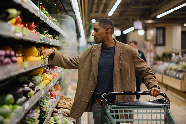
There’s something about eye-level placement that feels natural, like the product was meant for you. You don’t have to reach, bend, or search. It’s just there. And that convenience often translates into choice. Retailers know this, which is why the most profitable or promoted items are usually placed right where your eyes naturally land. According to merchandising insights, “Products positioned at eye level tend to have significantly higher sales than those placed above or below.”
What’s interesting is how this affects decision-making. When you’re scanning shelves, you’re more likely to pick what you see first, especially if you’re in a hurry. Cheaper or alternative options might be just a little lower or higher, but they require effort to notice. Over time, shoppers develop habits based on what they repeatedly see at eye level. It becomes familiar, almost automatic. Without realizing it, you’re being guided toward certain choices, not because they’re the best, but because they’re the easiest to notice.
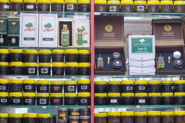
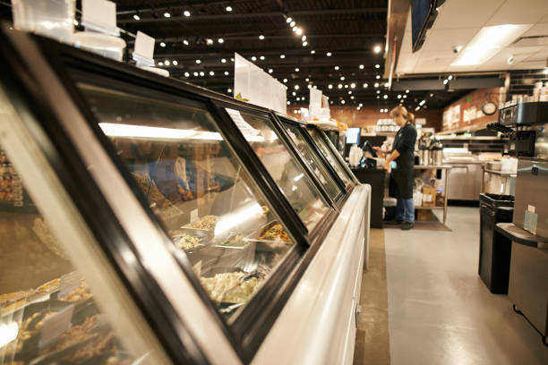
4. Strategic End Caps: The Power of the Aisle Edge
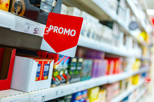
At the end of almost every aisle, there’s a display that stands out, stacked products, bright signs, sometimes even limited-time offers. These are called end caps, and they’re designed to grab your attention as you pass by. They feel like special deals, like something worth pausing for. Retail analysts often note that “end cap displays can boost product sales dramatically due to increased visibility and perceived promotion.”
But not everything on an end cap is necessarily the best deal. Sometimes, it’s just a product that the store wants to move quickly or promote heavily. The positioning makes it feel important, almost urgent. Shoppers tend to trust that what’s highlighted is worth buying, even without checking alternatives. It’s a subtle nudge not forceful, but effective. As you move through the store, these small stops add up, each one increasing the chances that something extra finds its way into your cart.
5. Narrow Aisles: Slowing You Down on Purpose
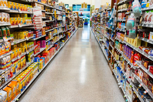
Have you ever noticed how some aisles feel just a bit tighter than expected? Not uncomfortable, but enough to make you slow down, adjust your cart, or pause when someone else is passing by. That slight restriction isn’t always accidental. Retail design experts explain that “narrower aisles can reduce walking speed, increasing the time shoppers spend near products.”
And the longer you stay in one spot, the more you notice. Items that might have gone unseen in a quick walk suddenly come into focus. You start scanning shelves more carefully, picking up things you hadn’t planned for. It’s not rushed, it’s gradual, almost unnoticeable. The space shapes your pace, and your pace shapes your choices. What feels like a simple adjustment in layout becomes a quiet influence on how much ends up in your basket.
6. Bakery Aromas Near Walkways: Scent That Sells
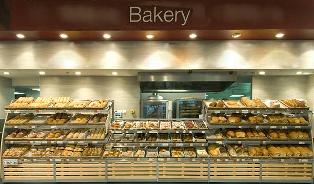
You’re just walking through, minding your list, and then it hits you, that warm, comforting smell of freshly baked bread or pastries. It slows you down almost instantly. You didn’t plan to stop, but now you’re looking. That’s not a coincidence. Many grocery stores intentionally position bakeries near main walkways or high-traffic areas because scent is powerful. As retail researchers often say, “Pleasant food aromas can increase dwell time and trigger impulse purchases.”
What makes this especially effective is how it works on memory and emotion. The smell of bread or baked goods feels familiar, comforting, even nostalgic. It creates a sense of freshness and abundance, making the entire store feel more appealing. And once you associate that feeling with what you’re seeing, it becomes easier to justify adding something extra to your cart. You might tell yourself it’s just a small treat, but these small, unplanned additions quietly increase your total spend without much resistance.
7. Bright Lighting on Premium Items: Spotlight on Spending
Some sections of the store just seem to shine a little more. The lighting feels warmer, brighter, more intentional. That’s often where premium or higher-margin products are placed. Lighting isn’t just about visibility; it’s about focus. Retail design experts explain that “targeted lighting draws attention to specific products, increasing perceived value and purchase likelihood.”
When something is well-lit, it feels important. It stands out from everything else around it, almost inviting you to take a closer look. And once you do, the chances of buying it increase. Even if a similar, cheaper option exists nearby, it may not catch your eye the same way. Over time, these subtle visual cues guide your attention again and again, shaping what you notice first and what you eventually choose. It’s not pressure,it’s placement, working quietly in the background.
8. Music Tempo That Sets Your Pace: Slow Shopping, More Spending
You might not think about the music playing in a grocery store, but it’s doing more than filling silence. The tempo, volume, and even the genre are often carefully selected to influence how you move. Studies in consumer behavior suggest that “slower music can lead shoppers to move more slowly, increasing time spent in-store and overall purchases.”
When the environment feels calm and unhurried, you naturally take your time. You browse a little longer, look at more shelves, consider more options. It doesn’t feel like you’re being influenced, it just feels relaxed. But that slower pace creates more opportunities to notice products you might have otherwise skipped. The longer you stay, the more likely you are to add something extra. It’s a quiet rhythm guiding your experience, shaping your shopping trip one step at a time.
9. Large Shopping Carts: Space That Encourages Filling
It’s easy to overlook, but shopping carts have grown larger over time. What once felt like enough space now seems small compared to what’s offered in many stores today. There’s a reason for that. Retail experts note that “larger carts can lead to increased purchasing, as customers subconsciously feel the need to fill the available space.”
When your cart looks empty, it creates a subtle sense that you haven’t bought enough yet. Even if you’ve picked up everything on your list, the visual emptiness can nudge you to add more. It doesn’t feel like overspending in the moment, it feels like you’re just making full use of the space. Over time, this design choice quietly increases the volume of what people buy, without them necessarily realizing why.
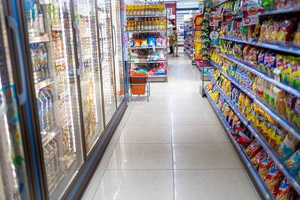
10. Winding Store Layouts: No Straight Path Out
In some stores, getting from the entrance to the checkout isn’t as direct as you’d expect. Instead of straight lines, you find yourself moving through curves, turns, and sections that guide your path. This kind of layout is intentional. Retail planners often explain that “non-linear store designs increase product exposure by guiding customers through multiple sections before checkout.”
What this means in practice is simple, you see more. Even if you came in for just a few items, the layout encourages you to pass through areas you didn’t plan to visit. And each of those areas presents new opportunities to pick something up. It doesn’t feel forced because the path feels natural, almost like you’re just exploring. But behind that flow is a carefully designed route that maximizes what you encounter before you leave.
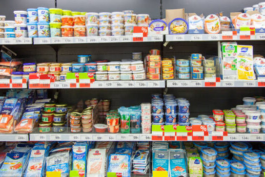
11. Strategic Product Pairing: Reminders You Didn’t Ask For

You go to pick up pasta, and right next to it is pasta sauce. Nearby, there’s cheese, maybe even seasoning. It feels helpful, like the store is saving you time by grouping related items together. And in a way, it is. But it’s also encouraging you to buy more than you originally planned. Retail insights often highlight that “cross-merchandising increases basket size by prompting complementary purchases.”
The idea is simple, if you see it, you’re more likely to remember you might need it. Even if it wasn’t on your list, it suddenly makes sense in the moment. You’re not just buying one item anymore; you’re building a set. These small additions feel logical, even necessary. And because they’re so easy to justify, they rarely feel like impulse buys. But over time, they quietly raise the total cost of your shopping trip.
12. Checkout Lane Temptations: The Waiting Game Trap
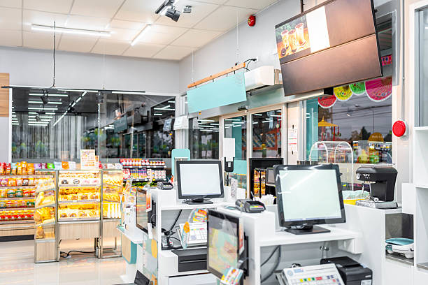
You’ve finished shopping, your cart feels complete, and you’re ready to pay. It should be the end of spending, but somehow, it isn’t. As you wait in line, you’re surrounded by small, easy-to-grab items; snacks, chocolates, drinks, maybe even everyday essentials. It feels harmless, almost like a last-minute convenience. But this setup is far from random. Retail experts often point out that “checkout displays are designed to capture impulse purchases during idle waiting time.”
What makes this moment so effective is your mindset. You’re no longer carefully comparing prices or sticking strictly to a list. You’re simply waiting. And in that pause, your guard is lower. Picking up one small item doesn’t feel like much, especially compared to everything already in your cart. But that’s exactly the point. These small additions are quick decisions, often repeated across many shoppers, quietly increasing overall sales. It’s a final nudge right before you leave, one that feels insignificant but adds up more than you’d expect.
13. Color Psychology in Packaging Zones: Feeling Before Thinking

Some sections of the store just feel more lively, more exciting. Bright reds, warm yellows, bold contrasts, they seem to pull your attention almost instantly. That’s not accidental. Color plays a strong role in how we perceive products. According to consumer behavior insights, “colors can influence emotions and buying decisions, often triggering urgency or appetite.”
When you walk past shelves filled with vibrant packaging, your brain processes those colors faster than it processes information like price or ingredients. It’s a feeling first, logic later kind of experience. You might not even realize why a product caught your eye, it just did. And once it has your attention, the chances of you picking it up increase. It’s subtle, almost invisible, but incredibly effective. The environment speaks to you before you even have time to think it through.
14. Seasonal Displays at the Front: Timely Temptations
Right when you walk in, you’ll often see items tied to a season or occasion; festive snacks, holiday-themed goods, or even back-to-school essentials. They’re placed prominently, easy to spot, and hard to ignore. It feels relevant, like something you might need right now. Retail experts often explain that “seasonal displays drive urgency by aligning products with current events and consumer mindsets.”
The timing is what makes it work. When something feels connected to the moment, it becomes easier to justify buying it, even if it wasn’t planned. You’re not just shopping anymore; you’re preparing, participating, or celebrating. That emotional connection turns browsing into buying. And because these displays change regularly, they keep the experience fresh, giving you a new reason to spend each time you visit.
15. Repetition of Popular Brands: Familiarity Builds Trust
As you move through the store, you might notice certain brands appearing more than once, maybe in different aisles, on end caps, or near checkout areas. It’s not just about availability; it’s about visibility. Repetition creates familiarity, and familiarity builds trust. Marketing research often highlights that “repeated exposure to a product increases the likelihood of purchase due to the familiarity effect.”
When you see the same product multiple times, it starts to feel like a safe choice. Even if you haven’t planned to buy it, it becomes more recognizable, more comfortable. And when it comes time to choose, that familiarity can tip the scale. You’re more likely to go with what feels known rather than what requires more thought. It’s a quiet reinforcement happening throughout your shopping trip, shaping decisions in the background.
16. Limited-Time Signs Without Real Limits: Urgency That Lingers
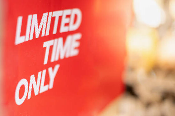
You’ve probably seen signs that say “limited time offer” or “while supplies last.” They create a sense that you need to act quickly, or you might miss out. It feels like a small window of opportunity. But sometimes, these promotions last longer than expected or reappear frequently. Retail strategies often rely on this perception, as “creating urgency can significantly increase purchase decisions, even when the limitation isn’t strict.”
The key here is the feeling of scarcity. When something seems temporary, it feels more valuable. You don’t want to miss a good deal, so you act faster, often without overthinking. Even if the item wasn’t on your list, the idea that it might not be available later makes it harder to walk away. It’s not always about the actual deadline, it’s about how it feels in the moment.
17. Mirrors and Clean Floors: The Subtle Comfort Effect
It might seem unrelated, but the overall look and feel of a store plays a role in how much you spend. Clean floors, reflective surfaces, even mirrors in certain sections, they create a sense of space, comfort, and quality. Retail experts suggest that “a well-maintained environment encourages longer shopping time and more positive purchasing behavior.”
When a store feels clean and open, you’re more relaxed. You don’t feel rushed or overwhelmed. That comfort makes it easier to spend more time browsing, and more time often leads to more purchases. It’s not about a single product, it’s about the atmosphere as a whole. The environment supports the experience, making everything feel just a little more enjoyable and worth exploring.
18. Decoy Pricing Displays: Making Expensive Look Reasonable
Sometimes, the way prices are presented matters just as much as the prices themselves. You might notice three similar products placed side by side, one cheap, one mid-range, and one noticeably more expensive. It feels like you’re being given options, and you are, but there’s usually a subtle intention behind it. Behavioral economists often explain that “introducing a higher-priced option can make mid-priced items appear more reasonable, increasing their likelihood of purchase.”
What happens in that moment is quiet but powerful. Instead of asking, “Do I need this?” you start asking, “Which one should I choose?” The focus shifts from whether to buy to how much to spend. And more often than not, people settle somewhere in the middle, feeling like they’ve made a balanced, sensible decision. The highest-priced item acts as a reference point, gently nudging your perception of value. It doesn’t force you, it just reframes the choice. And that small shift is often enough to increase how much ends up in your cart without it feeling like overspending.
19. End-of-Aisle Illusions: Deals That Feel Bigger Than They Are

Those displays at the ends of aisles always seem important. They’re bold, visible, and often stacked with products that look like great deals. Naturally, you’re drawn to them. It feels like you’ve stumbled upon something worth grabbing. But not everything placed there is actually discounted. Retail insights often note that “end-cap displays increase product visibility and sales, regardless of whether the item is on promotion.”
The positioning does most of the work. Because these spots stand out, they create an impression of value and urgency. You assume it’s there for a reason, maybe it’s cheaper, maybe it’s popular and that assumption can lead to quick decisions. Sometimes the deal is real, sometimes it’s just well-presented. Either way, the effect is the same: you pause, you consider, and often, you add it to your cart. It’s a visual shortcut that feels like smart shopping in the moment.
20. Subtle Store Flow Toward Checkout: A Quiet Push to Finish Full
As you move toward the end of your shopping trip, the layout begins to guide you more directly. The path feels clearer, more focused, almost like a gentle nudge toward checkout. Along the way, there are still products placed strategically, last glances, final options, small additions. Retail design thinking often points out that “store flow is structured to maintain engagement until the point of purchase.”
By this stage, your cart already feels established. You’ve made most of your decisions, and you’re mentally wrapping up. That’s what makes this moment so effective. You’re less likely to evaluate each new item carefully. A small addition feels harmless, almost like a finishing touch. And as you finally head to pay, everything you’ve picked; planned and unplanned comes together.